2020-02-06 Fake news at Truthdig?
I made a FB post on this article, How Corporate Media Make Pete Buttigieg Look Like He’s Winning.
I’m having trouble understanding this. Could you perhaps circle the number that’s 50x larger than another?
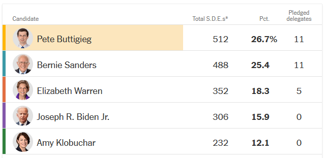
And the graph labeled “41 Delegates are at stake in Iowa” seems to put Pete and Bernie on adjacent lines and then ordered Pete first alphabetically.
It feels to me that you’re making assertions that look to be backed up with numbers, but which are not, hoping that people will just accept your assertion and think that they don’t really get it but it’s surely true: Look! There’s a graph!
Suddenly I think I understand
The writer looked at this image
| Bar chart? |
|---|
 |
and thought he was looking at a bar chart!! It took me a long time to figure out how his mind must be (not) working.
The comments posted after mine are horrible Bernie Bro hatred and creepiness.